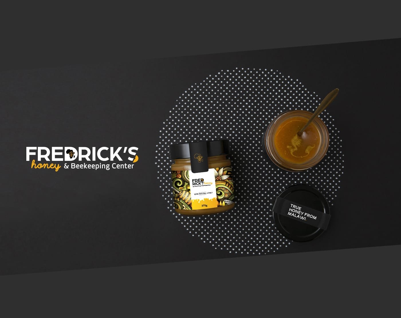
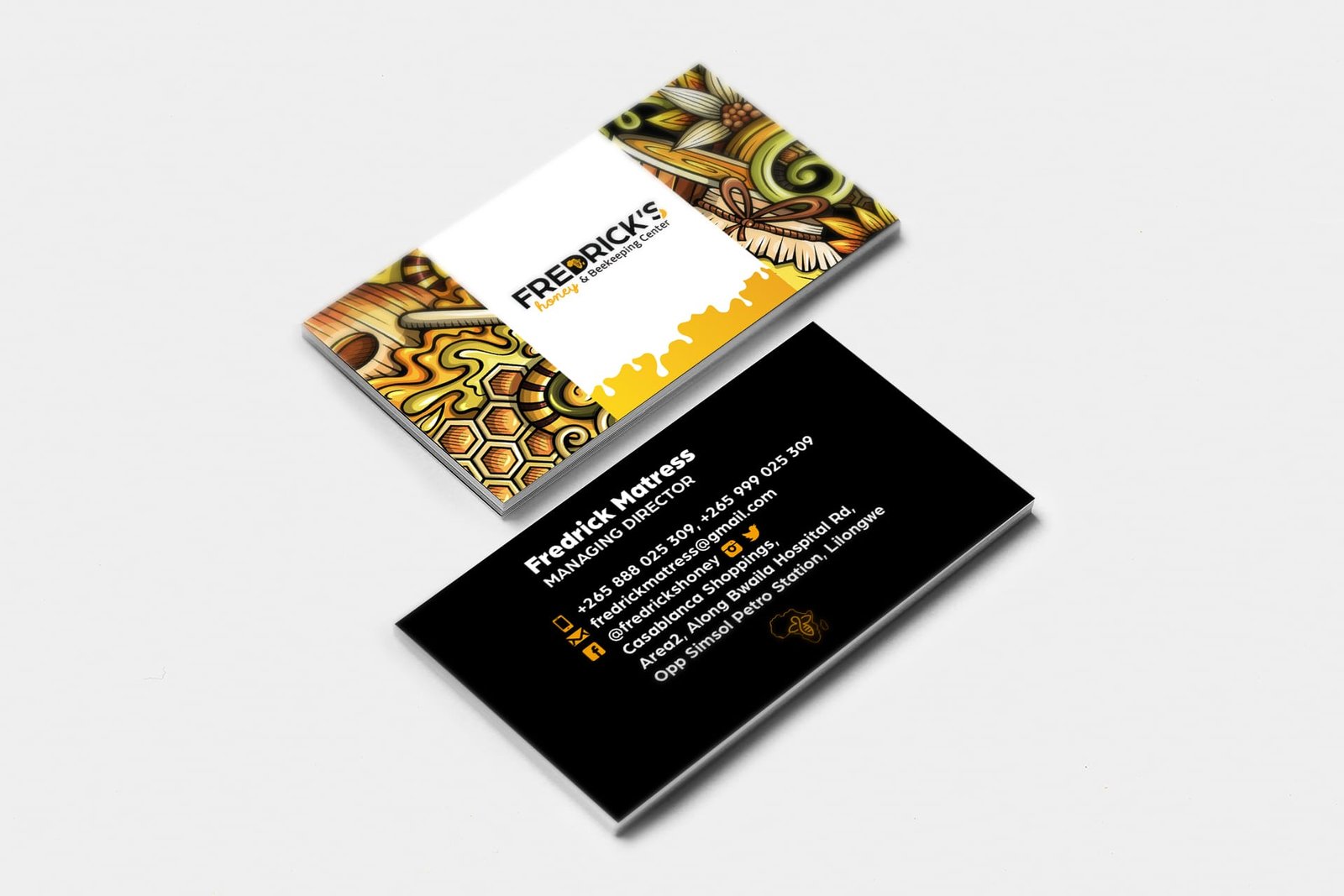
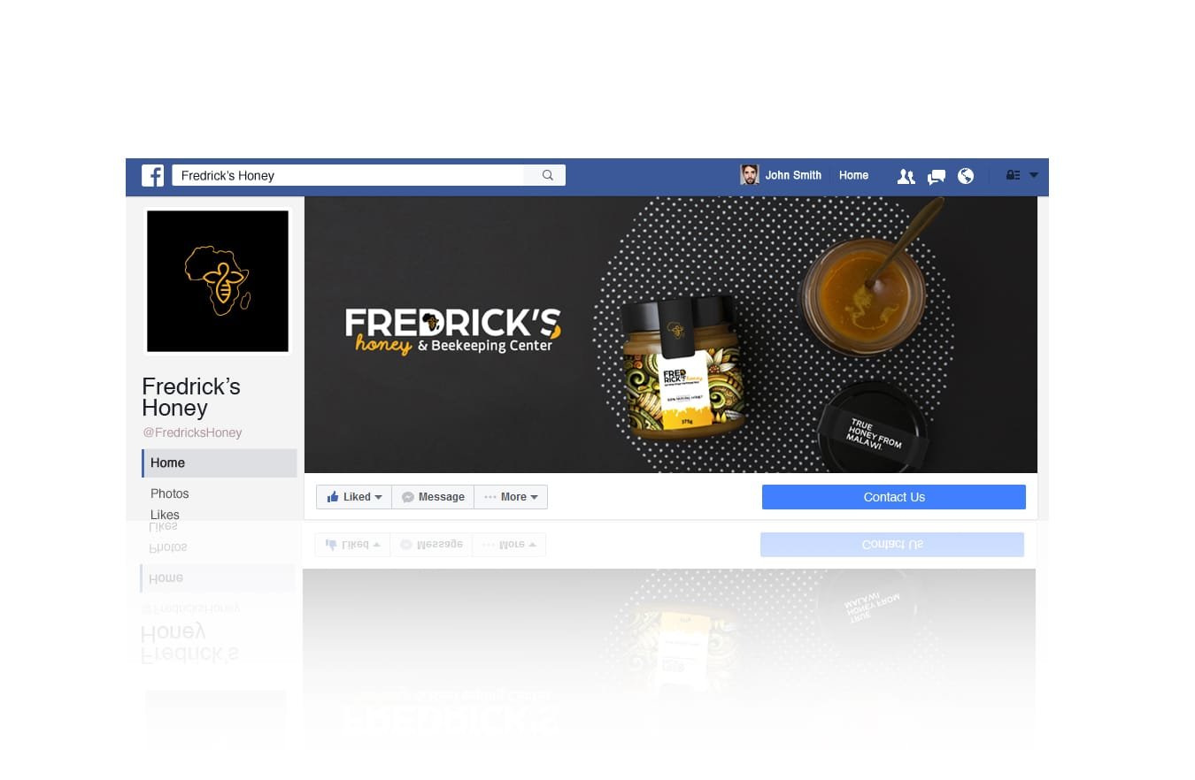
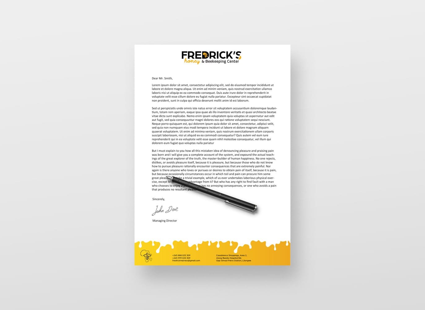
For Fredricks Honey, I developed a brand identity that highlights the purity and authenticity of their locally sourced honey. The packaging design features clean, natural elements and earthy tones, allowing the honey’s golden color to shine through while evoking trust and quality.
The overall design successfully positioned Fredrick’s Honey as a premium, sustainable choice in a crowded market, capturing both attention and loyalty.